PUWYLO
Pick up where you left off
With 15M users visiting our app globally, the Home Screen is the first thing they see.
As part of our core objective, we play a crucial role in delivering the best experience by helping users seamlessly pick up where they left off
The problem
User problems
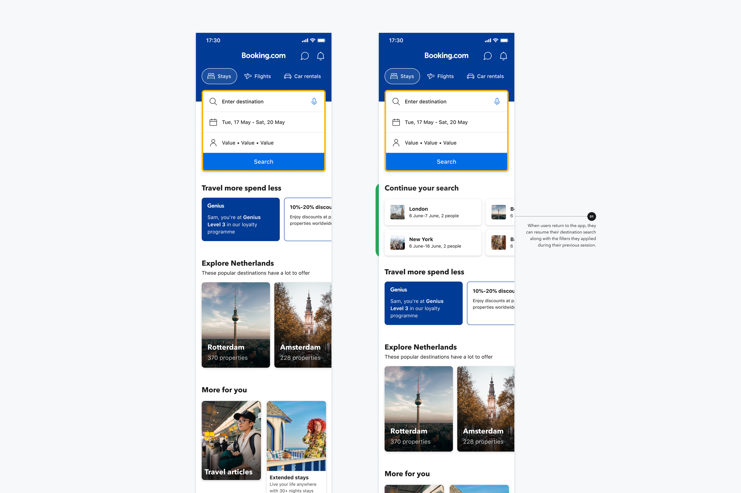
When users browse properties, there’s no easy way to revisit them. Users must restart their search and manually locate the desired property again.
Comparing the same destination across different dates requires repeating searches, adding friction and effort.
“Continue you search” is currently limited to Stays only, with no way to PUWYLO for another trip elements like Flights, Cars, Taxis, or Attractions.
Journeys that start on one platform (e.g. Desktop) are difficult to seamlessly continue on Mobile Web or App.
Business problem
50% of users only make a single booking in the app.
90% of users make 5 or less bookings in a year.
A large portion of users return to the app without an upcoming booking (70-80%), indicating strong potential to re-engage and support ongoing trip planning.
*All quantitative data has been intentionally generalized to protect sensitive company information.
Opportunity
Help users seamlessly pick up where they left off across all verticals — saving time, reducing friction, and enabling more confident trip planning.
The Goal
As part of the discovery phase, I reviewed how other travel and consumer apps support users in picking up where they left off — across first, second, and repeated sessions.
The analysis focused on:
How recent activity is surfaced
Whether context is preserved across sessions
How multiple trip elements are connected or separated
Key observations:
Most competitors prioritize recent searches or viewed items, but typically treat each vertical in isolation
Cross-vertical continuation is rare and often fragmented
Non-travel apps (e.g. media and subscription platforms) set stronger expectations for continuity by clearly preserving progress and context
This highlighted a gap and opportunity to differentiate by supporting multi-vertical continuation in a single, connected experience.
Competitor analysis
User needs for picking up where they left off
A continue your search feature that saves time or is more convenient than re-creating a previous search criteria
A way to efficiently compare multiple trip elements from their previous searches
A way to know they got the best deal by clearly seeing the price, or price changes
A way to view trip elements (verticals) searches for the same trip in the same place
Qualitative - user research
User interviews and usability testing revealed consistent needs around resuming trip planning.
Workshop
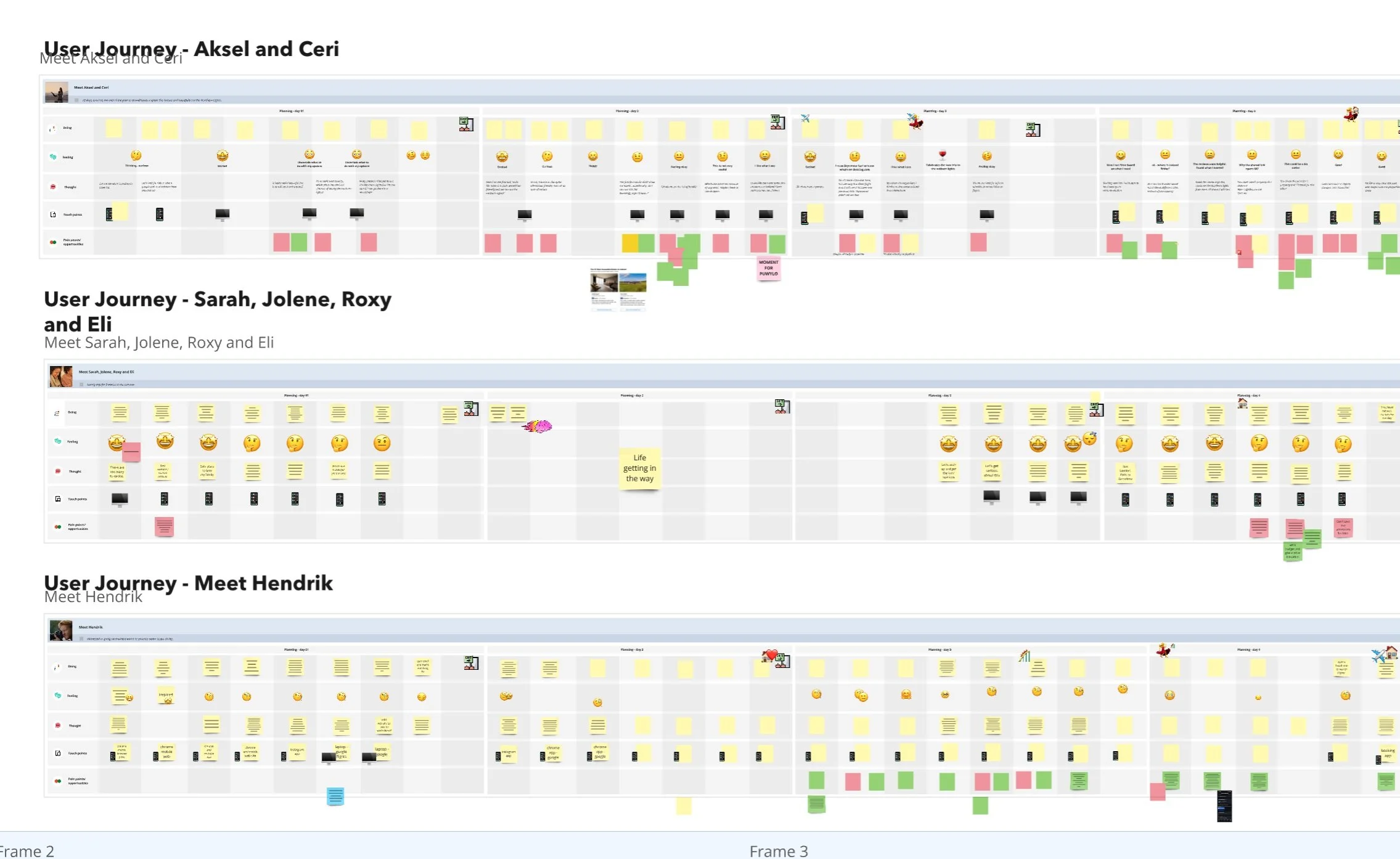
The purpose of the workshop was to leverage Booking's Connected Trip personas to design tailored journeys for each persona based on their needs.
This involved mapping out current challenges, considering multi-platform use (both app and web) during the planning phase, fostering collaboration, and addressing the specific needs of each persona.
Participants: UX Writer, Researcher, PM, EM, and Backend Engineer.
The workshop spanned two days to complete the entire journey. I divided the team into three groups, with two participants in each group.
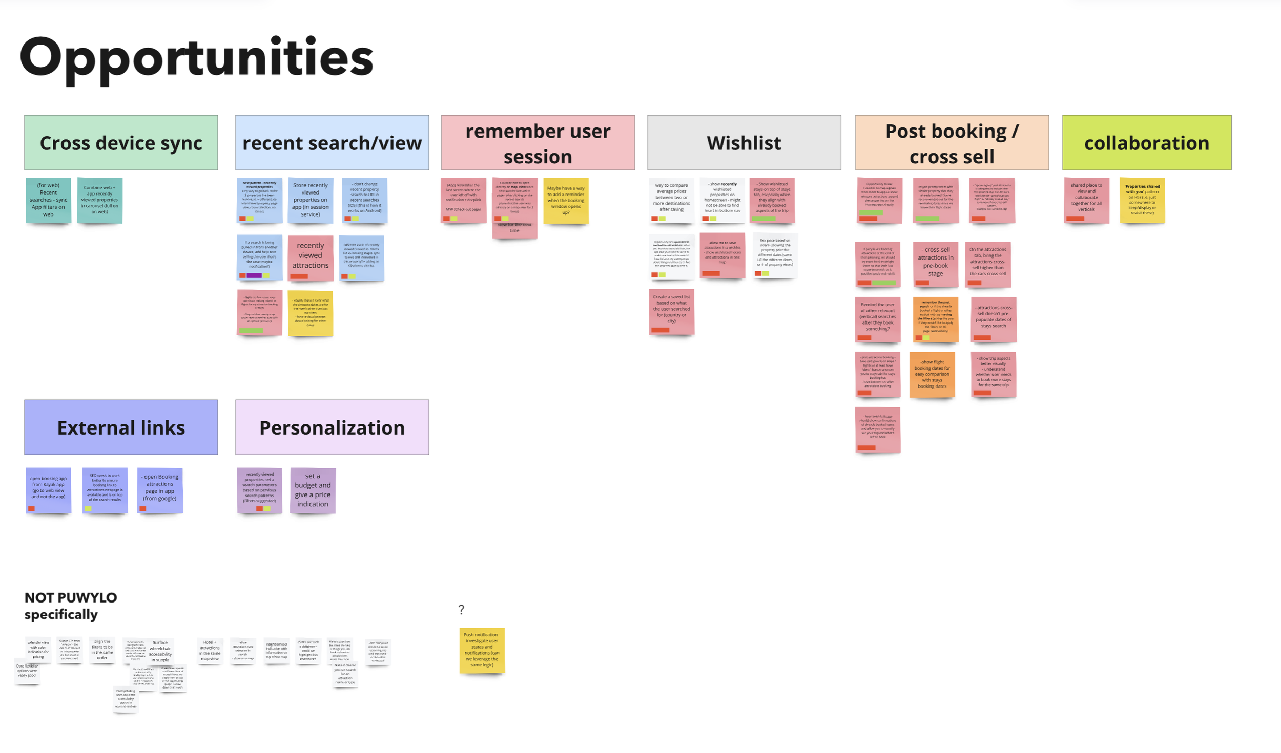
After synthesizing the workshop outputs, we clustered recurring pain points and opportunities into clear themes.
These themes helped us:
Prioritize the most impactful problems to solve first
Identify shared needs across personas rather than isolated edge cases
Align stakeholders around a common understanding of where continuity breaks down
This synthesis directly informed the direction of the “Pick up where you left off” experience and shaped the solution space explored in subsequent design iterations.
Key outcomes
Create a cohesive, cross-platform experience where users can seamlessly pick up where they left off regardless of device, vertical, or moment in the journey.
By aligning App and Web around shared journeys and priorities, this vision supports continuity, reduces friction, and enables more connected, end-to-end trip planning.
Vision
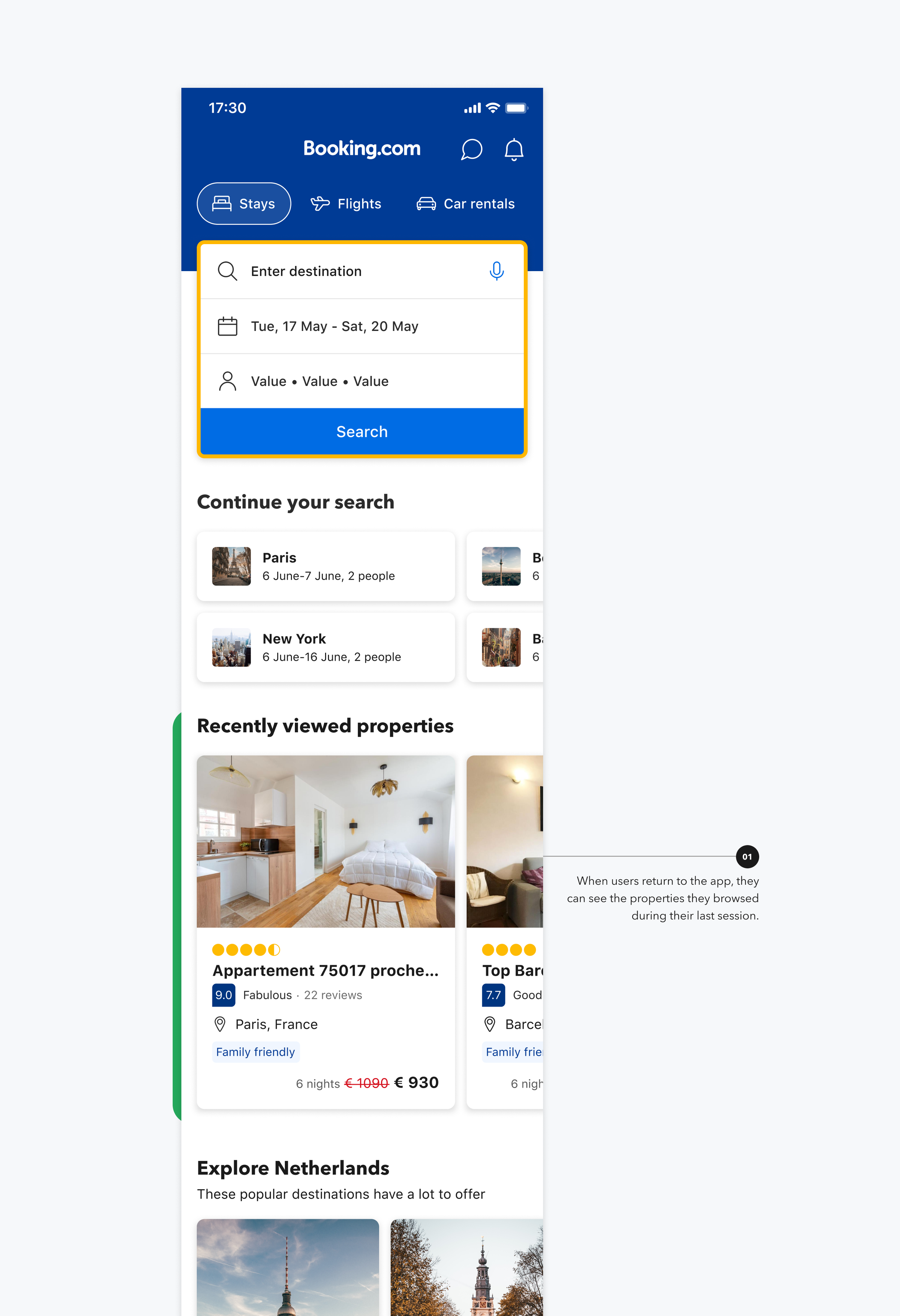
01. Recently viewed properties
Solutions
🚩 Problem:
Users currently don’t have quick access to properties they’ve recently viewed.
🎯 Goal:
Add a "Recently Viewed" section to the Home screen to help users in the planning phase quickly return to properties they've already seen.
🟡 Status:
Currently in experimentation on iOS.
🧠 Insights:
The carousel showed strong engagement, indicating high user interest in resuming previously viewed content
Increased visits to property pages after interaction
More users progressed into the booking funnel
Learnings around navigation behavior led to refining the “Back” action to better support return to search results rather than the Home Screen
*Metrics have been intentionally generalized to protect sensitive company data.
02. Wishlisted properties
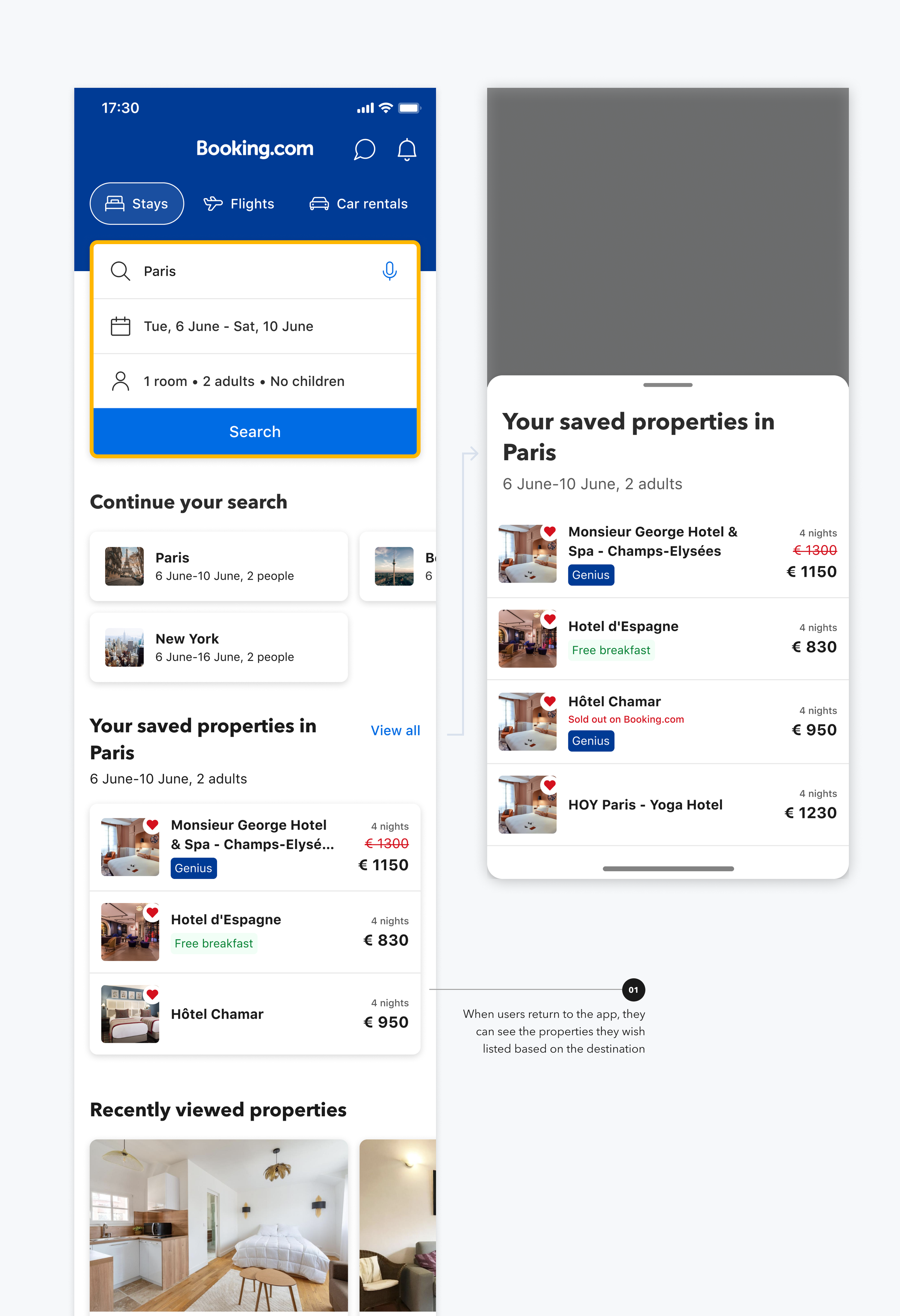
⏱ Duration: 9 weeks – February 3 to April 10, 2025 (~1.1M daily users in scope)
🎯 Goal: To improve the PUWYLO experience by making it easier for users to compare prices for properties they are interested in.
Status: ✅ Full-on iOS and Android (Still on experimentation).
📈 Key User Impact Metrics:
Improved engagement with saved properties
Increased booking intent from wishlisted properties
Positive lift across key PUWYLO funnel metrics
Results showed a consistent positive impact across engagement and conversion metrics, supporting a broader rollout.
03.
Abandon in the cart
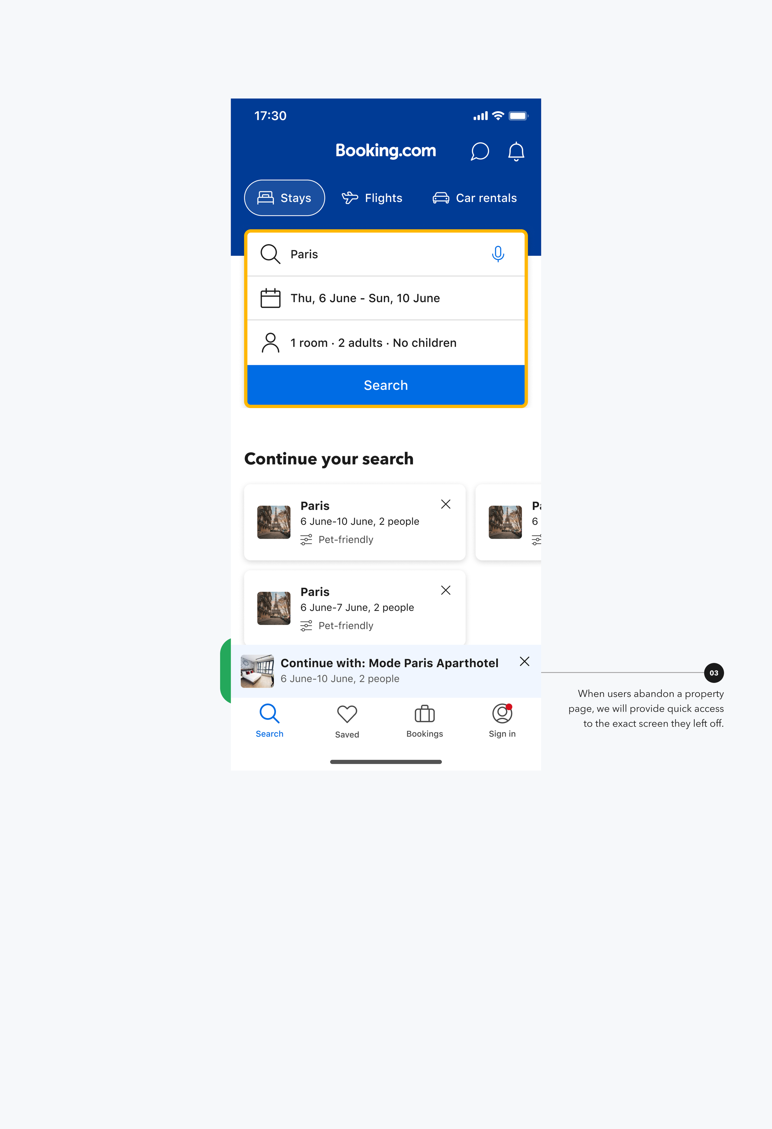
🚩 Problem:
When users enter the booking flow and drop off, there is no clear way to return to the same property and step they left off.
💭 Insights:
Research and data indicated high booking intent after drop-off, but many users did not engage with reminder notifications. This revealed an opportunity to support journey continuation directly from the Home screen.
Solution:
We enabled users to easily return to the exact step in the booking flow they had previously abandoned.
Status: ✅ Full-on both iOS and Android.
📈 Impact:
Meaningful improvement in conversion
Strong signal of high-intent recovery after drop-off
*Metrics have been anonymized to protect confidential company data
04.
PUWYLO hub
🚩 Problem:
The PUWYLO region is expanding, with all components based on the last search, making it harder for users to easily pick up where they left off.
🎯 Goal:
To make it easy and seamless for users to PUWYLO by tracking their signals, displaying all relevant content, and providing quick access, without causing confusion or information overload.
💭 Hypothesis:
Creating a unified space on the HS that displays Viewed, Saved, and Booked items in a single list will make it easier for users to manage and PUWYLO.
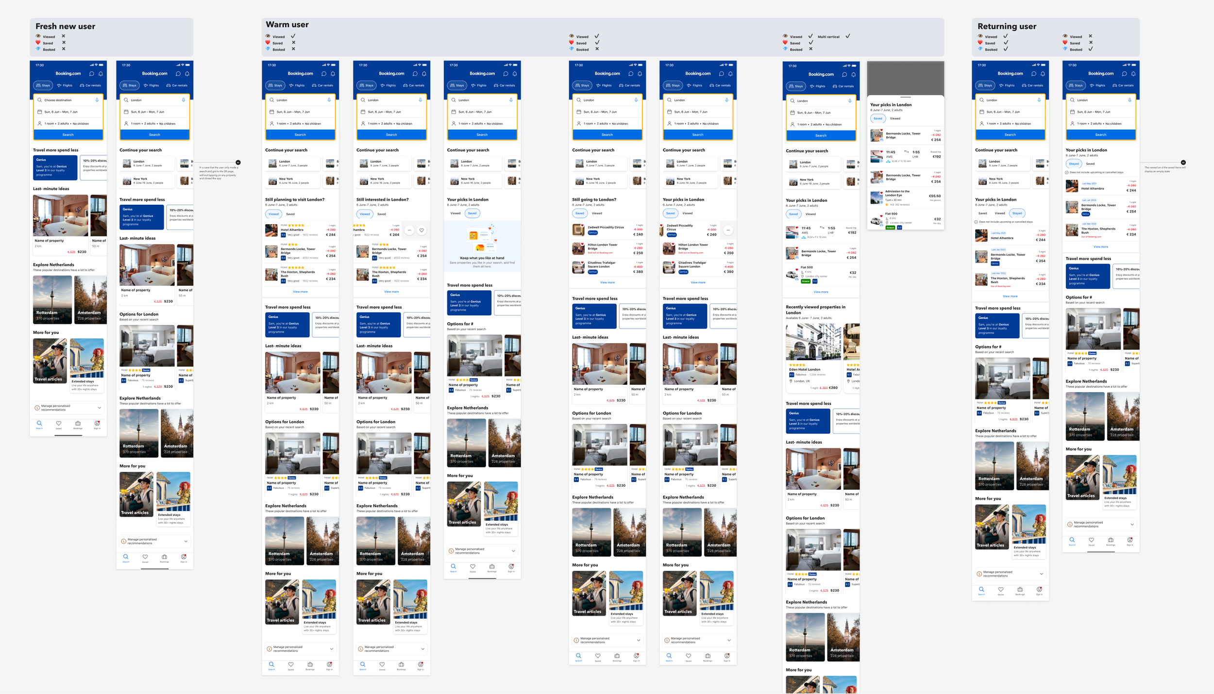
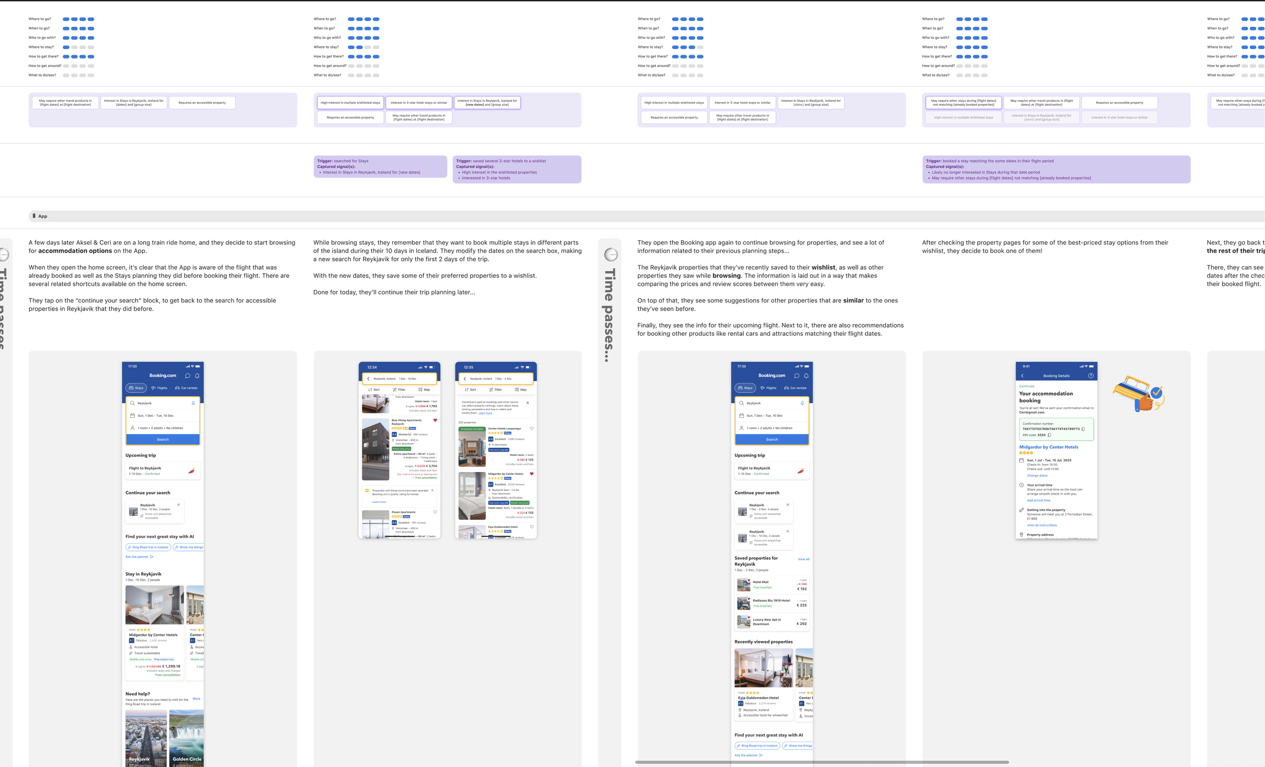
A unified space that brings together Viewed, Saved, and Stayed items across multiple verticals, personalized based on the user's last search. The list supports gesture-based interactions, allowing users to swipe left to save or remove items—making it easier to pick up where they left off, regardless of product.
For MVP we are going to test this concept only for Stays (accommodations) related content.
A combination of the two core components of the Pick Up Where You Left Off experience:
“Continue Your Search” – a multi-vertical entry point based on recent user intent
The PUWYLO Hub – a centralized space that surfaces everything the user started exploring, saved, or previously stayed at
Together, they create a seamless way for users to resume their journey across products.
Vision for the PUWYLO Hub:
Next steps
We are going to explore pickup where you left off for other verticals, exposing users with a single intent to other verticals.