
App
Multi vertical home screen
Discoverability & awareness of our multi-vertical offering is critical to enable customers to consider Booking.com as a provider of their overall trip planning needs.
Before defining the problem, I focused on understanding cross-vertical user behavior across the Booking app.
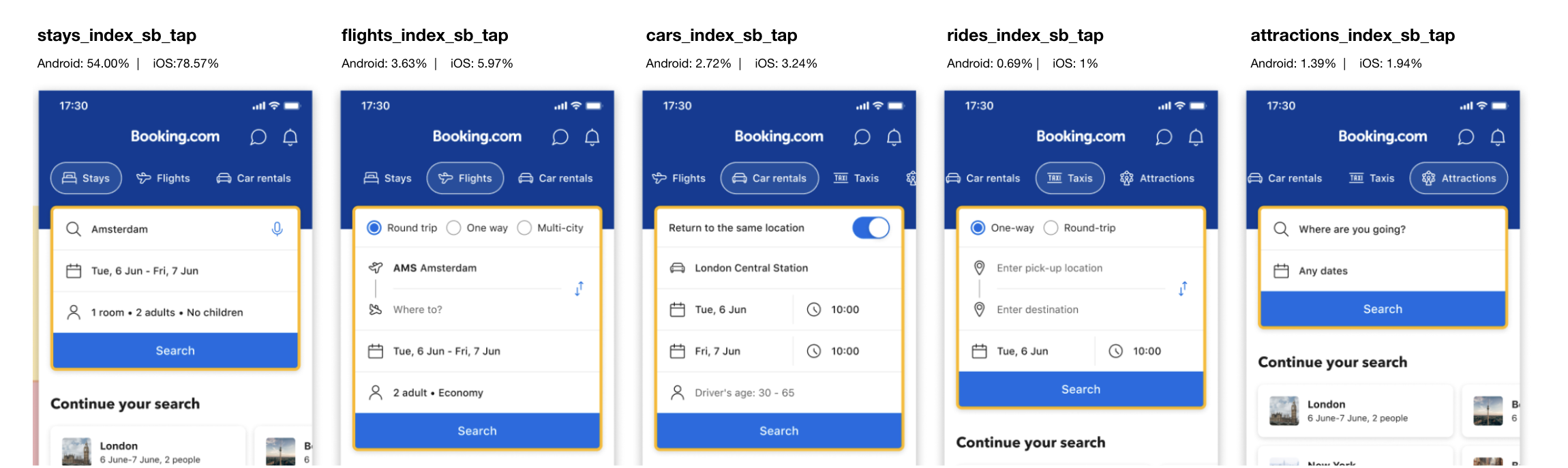
Overview of user engagement across verticals, segmented by platform:
Key insights
Most users book within a single primary vertical (Accommodation/ Flights)
Cross-vertical bookings are relatively uncommon and usually secondary
Non-accommodation verticals are more often add-ons than standalone journeys (Taxi/ Attractions).
Search for Attractions on App -
The Attractions page was particularly difficult to find on the mobile app, with users needing to scroll horizontally through the navigation buttons to be able to reach the Attractions page.
User research
The problems
01
Home Screen Prioritizes Accommodation Only
Our current experience is heavily anchored in the ABU, which results in:
- ABU-first setup limits visibility
- No onboarding for other verticals
02
Verticals Are Treated in
Isolation
The current journey doesn’t enable seamless exploration or decision making across verticals.
This leads to:
- No continuity across products
- PUWYLO only supports ABU
03
User Search Context Is Not Persisted
We don’t persist users' search context across the app (PUWYLO) As a result:
- Users re-enter info each time
- Context isn’t carried over
04
Loyalty Benefits Aren’t Surfaced Pre-Booking
Key benefits are under-leveraged in early stages today:
- Values not visible pre-booking
- Selling points appear only post-booking
01.
Improving top navigation
Solutions
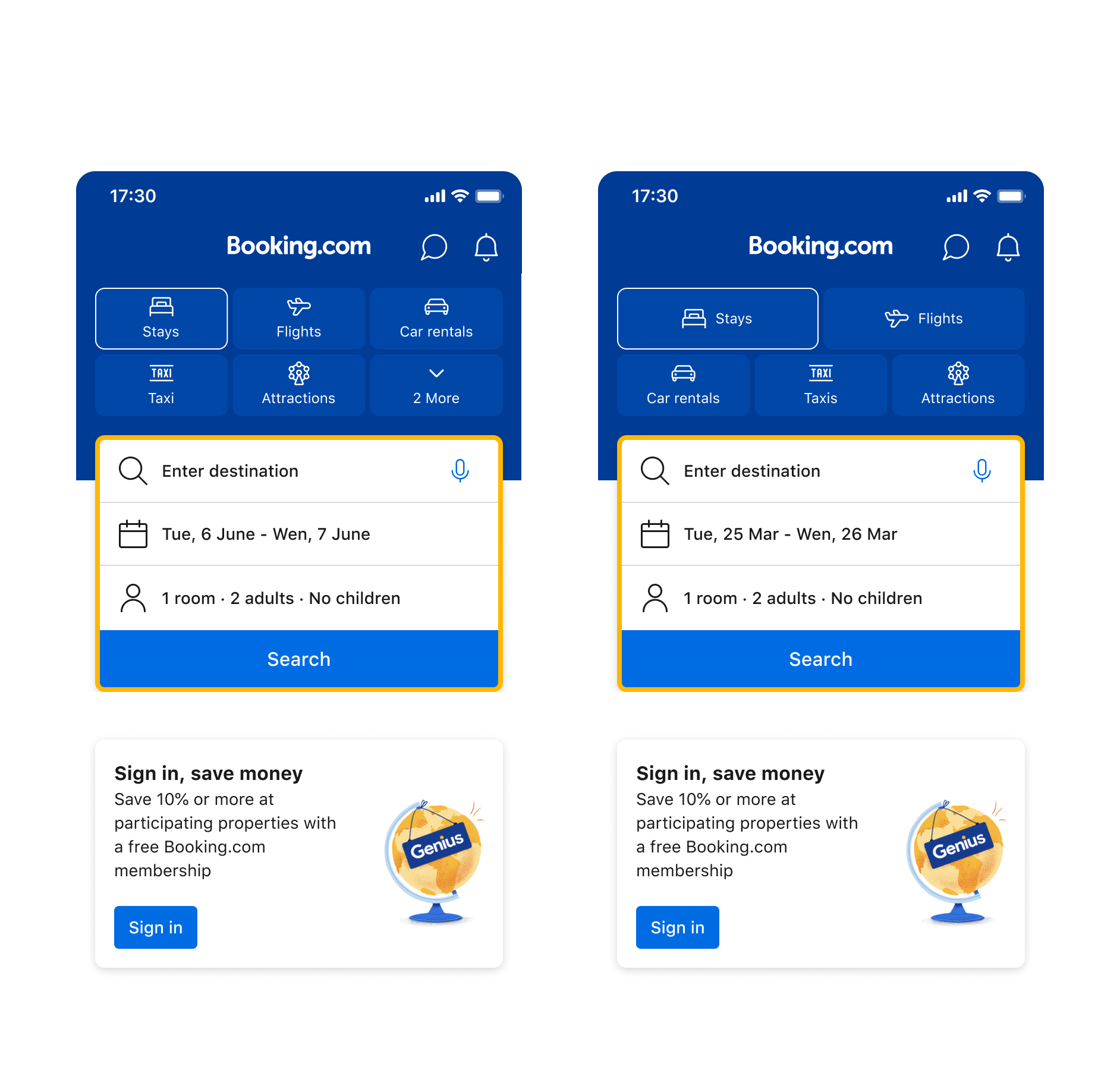
🚩Problem: Home Screen Prioritizes Accommodation Only
The entry points for verticals currently rely entirely on the navigation bar, which shows only three verticals within the viewport. As a result, users tend to miss the others. For less visible verticals, the tap-through rate drops significantly, which we believe is due to their limited visibility.
💭Hypothesis:
Introducing subtle visual cues, such as micro-animations, could improve the discoverability of additional verticals and increase engagement without disrupting the primary booking flow.
🧠Insights:
Subtle gradients slightly improved discovery but had limited impact on engagement.
Micro-animations significantly increased click-throughs to less visible verticals, such as Taxi and Attractions, without negative side effects.
However, these changes did not yet demonstrate a clear improvement in booking or conversion KPIs.
🚩 Problem: Home Screen Prioritizes Accommodation Only + Verticals Are Treated in Isolation
💭 Hypothesis:
Making all verticals visible at a glance would improve awareness and early-stage engagement across services.
Status:
The experiment increased engagement with non-accommodation verticals, but did not result in a measurable improvement in conversion or downstream booking metrics.
Key learning:
While visibility alone can drive exploration, it is not sufficient to change booking behavior. Users require clearer intent, context, and value propositions to progress toward conversion across verticals.
Decision:
We did not move forward with this approach as a standalone solution, and instead focused on designs that better support intent-driven discovery.
02.
All verticals visible at a glance
03.
Exposure point for other verticals
🚩 Problem: User Search Context Is Not Persisted, Home Screen Prioritizes Accommodation Only + Verticals Are Treated in Isolation
💭 Hypothesis:
A large portion of Home screen users arrive with recent search context and are already in a discovery or planning mindset. Surfacing contextual exposure points based on recent searches could increase early awareness and encourage multi-vertical exploration.
Status: ✅ Full-on iOS.
Key learning:
Cross-vertical engagement is more effective when introduced within an existing search context, rather than through generic exposure on the Home screen.
04.
Pickup where you left off for Flights
🚩 Problem: User Search Context Is Not Persisted
There was no clear way for users to resume their previous searches across verticals.
💭 Hypothesis:
Introducing a Flights recent search component can help users plan their trips more effectively by comparing prices, exploring destinations, and seamlessly picking up where they left off.
Status: ✅ Full-on iOS.
📈 Impact:
The Flights Recent Search component delivered a significant positive business impact, exceeding internal performance expectations and validating the value of pickup where you left off experiences for flights.
05.
USPs for other verticals on Stays tab
🚩 Problem: Loyalty benefits and value propositions for non-accommodation verticals are not surfaced early enough in the Stays journey.
💭 Hypothesis:
Surfacing relevant vertical benefits earlier in the Stays journey would increase awareness, engagement, and cross-product usage.
Status: ✅ Full-on both iOS and Android.
📈 Impact:
The feature drove a substantial increase in conversion across broad-intent users and meaningfully contributed to overall transaction and revenue growth.
Vision
Help users plan end-to-end trips by preserving their search context and progress across verticals in one cohesive experience.
This vision guided the exploration of horizontal and vertical “Continue your search” concepts to better support multi-vertical discovery and trip planning.
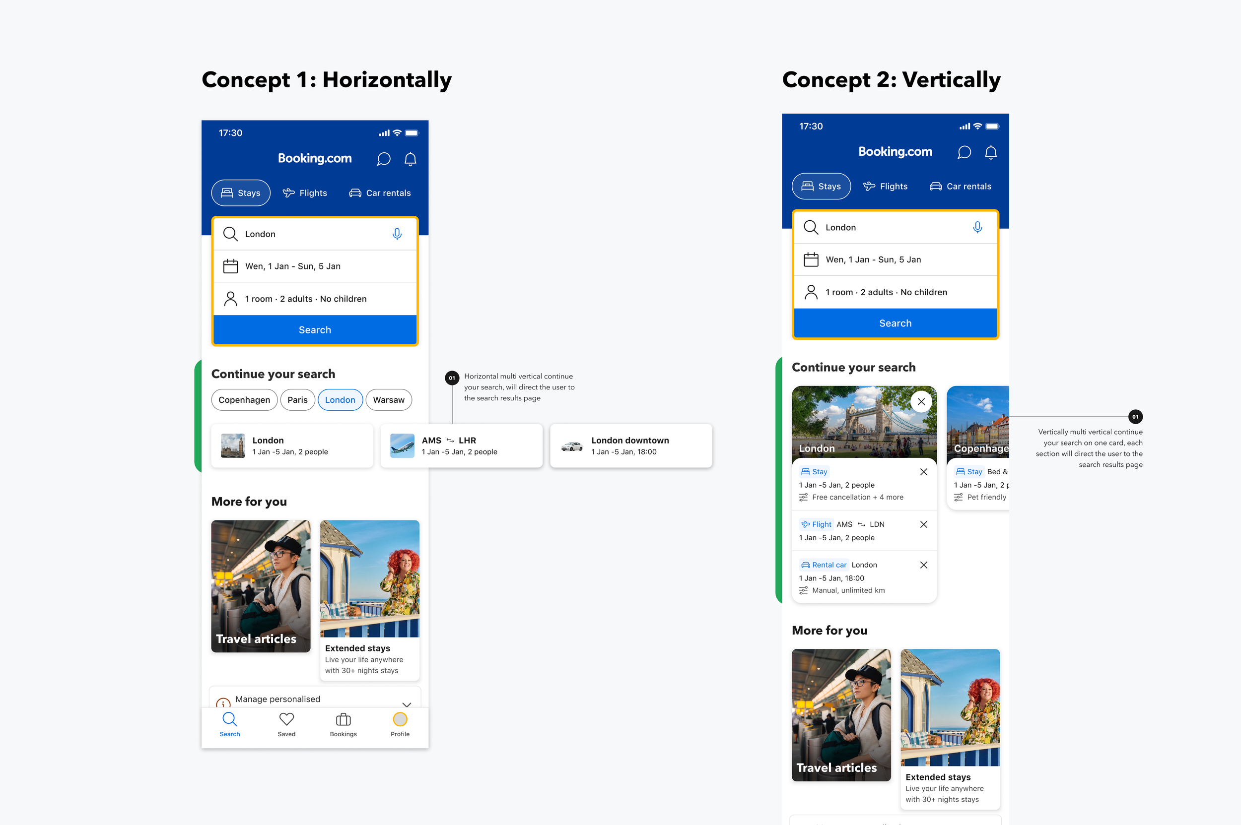
We explored two approaches for presenting cross-vertical “Continue your search” experiences: a horizontal layout and a vertical, aggregated card.
Both concepts were understood by users and clearly communicated where they would be taken upon interaction. However, when comparing the two approaches, users consistently preferred the vertical layout.
The vertical concept was perceived as more intuitive and easier to understand, as it grouped all relevant verticals for the same destination and dates in one place. This reduced cognitive load and helped users think about their trip as a single, connected journey rather than separate tasks.
The ability to personalize the card by removing searches was also highly valued, reinforcing the need for flexible, user-controlled experiences.
Summary from the usability testing:
Based on these findings, the vertical “Continue your search” concept will be validated through experimentation, starting with high-intent surfaces such as Stays and Flights, and gradually expanding to additional verticals.
This phased approach allows us to test scalability while preserving clarity and relevance across the home experience.